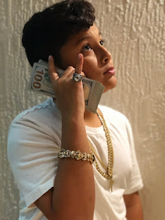
The program that I used to edit my cover is Indesign, an Adobe program which allows us to write and edit picture all in one. At first the program was difficult to use as I was inexperienced while using the program. For the editing of my blog post, I tried to keep the image as close to its original as possible. I edited out the blemishes in the pictures, such as marks on the face and on the arms, as well as inconsistencies in the image, such as certain parts being blurred that weren't supposed to be blurred. On the top of the cover image, I will be putting my magazine's title "8TH STREET" is a mix of red and white colors, while using the font Hiragino Kaku Gothic StdN, as its boldness and kerning spacing is perfect for my title to cover the whole width of the page. For the subheadings, I plan on using the Rockwell font as it catches one's attention, yet doesn't distract from the cover image. For the subheadings, I wrote things that I believe a magazine woul...


